

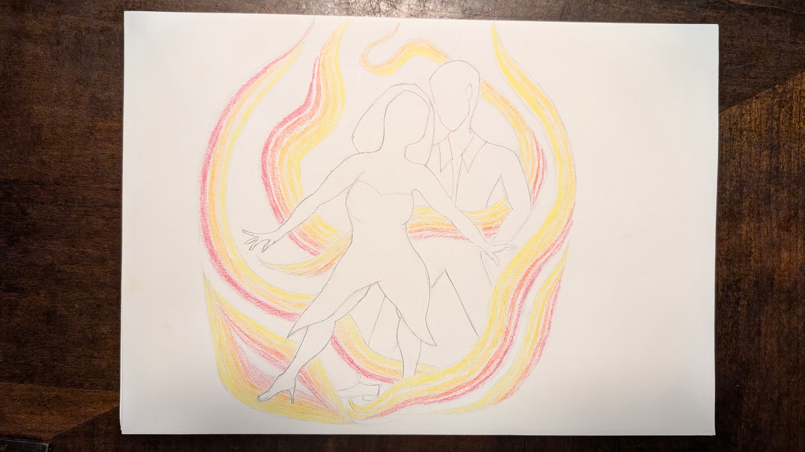
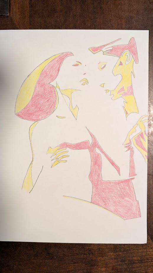
I submitted 3 drawings as icons for a salsa dance team. These are the two that were not chosen.
You must log in or register to comment.
These are very nice! Beautiful drawings, but quite busy and detailed to use as a logo. All the meaning and intricacies would get lost when shrunken down to business card size.
Thank you! I got really nervous that I was going to under deliver, so I tried to demonstrate effort to not seem like I was being neglectful or careless. Your words were consoling. 😊
Ooo I like the first one a lot. Do you have the one that was chosen?
Thank you!! It has a lot of meaning in it:
It shows the individual dancers.
-
The lady is the beauty and focus of the dance. She is in his arms and submissive (follow dance role). Her other hand is in his showing she is giving him control. Her face is also up and careless. I tried to make the hair look like two different women on the team, one kinky hair and the other straight-curvy. I didn’t realize it at the time, but I guess it represents the blended nature of Latin culture and salsa. Though admittedly, that wasn’t my original intent. It just naturally happened that way, which I guess is more authentic anyway.
-
The guy is to the side and the stable force that is keeping her up (lead dance role). He’s looking down at her because he controls the dance. He is holding her hand up confirming he accepted control. The hair is also ambiguous.
The white space between them shows that when they are dancing, they become one.
The colors represent the studio’s name.
Do you have the one that was chosen?
Yes, I do have the chosen one, but since it’s for the team, I rather wait until it is finalized before sharing it.
-