
You must log in or register to comment.
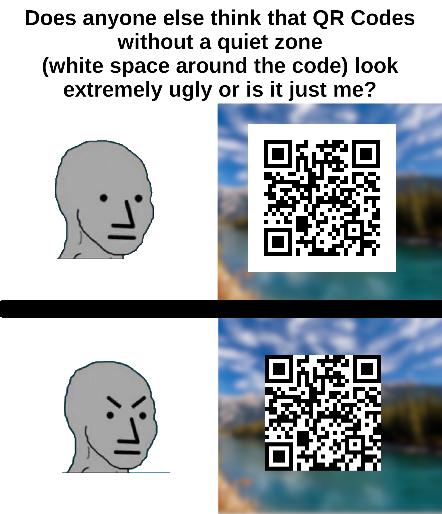
the bottom one is not a qr code. The padding is part of it.
It’s not just ugly, they don’t scan properly. I’ve had this problem many times on codes without padding because my email client or browser was set to use a dark theme.
It often goes unnoticed because most people are using a white or clear background that gives enough contrast.
It’s not just ugly, it’s against the spec. The quiet zone is meant to be 4 “dots” wide on all sides for the code to be optimally readable.
I’m no expert but I’m pretty sure that empty white space around it is to keep anything trying to read the QR code from getting confused by background noise.
I’m saving this for later, I have people send me print ads (yeah really) and this will help.
I’ve never given it a single thought.
It is not weird. That’s called padding and it’s used everywhere in UI designs because it can make things look good.
I think that the white space is actually part of the protocol?
It’s required for contrast detection.
Also, if it was placed on something with a black background, the borders would bleed into the background and be unrecognizable when scanning.
This is why graphic artists don’t get to determine functional standards.
It is.
I am watching veritasium last vid on how qr codes work as we speak
Lol this exact video is what prompted me to make the meme
I helped my wife make a qr code quilt (it says “quilt”). There wasn’t quite enough border around it, and you can get it to scan, but it’s not super reliable.
It is - without the quiet zone, it makes detecting the locator pattern really difficult, especially in one’s looking for the 1:1:3:1:1 ratio.
I spent 20 years in graphic design shit and wish I’d thought of something as cool as “quiet zone”.
I’ve seen at least one company press kit in rules on how to display their logo refer to it as “respect distance”.
Personally I’m going to start saying “quiet zone” instead white space. I’ll probably get dumb looks anyway.
Not quite the same but “bleed” is pretty cool!
Its oddly offputting 😂
The white space is too big IMO, it should be one or two squares at most. Both of the examples look really bad.
Spec says 4.
You can’t circumcise the QR code man!
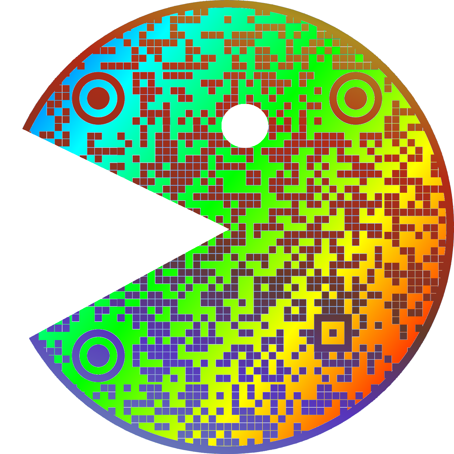
Does it really scan when both timing patterns (zebra stripes between the three corner “squares”) are interrupted?
Edit: Not even Google Lens can scan it. (Edit edit: worked fine with screenshot.) Next time, avoid the red regions when putting logos etc. on mid-size (3+1 “squares”) QR codes:
🟥🟥🟥🟥
🟥🟩🟩🟩
🟥🟩🟩🟩
🟥🟩🟩🟥You can rotate the code of course but not flip it.
I recommend using a dedicated qr scanner instead of google lens, because even if it can scan qr codes, it isn’t optimised for it. Sometimes it can’t even detect a medium-sized qr code in a screenshot, and it looks like they haven’t even implemented the full standard.
Here’s a pretty good qr-reader I can recommend: https://play.google.com/store/apps/details?id=com.blogspot.aeioulabs.barcode
Not open source, which is a red flag for me. There are QR scanner&generator apps on F-Droid, and you can check the source code that they do NOT send the scan result to some server and do NOT sneakily take a pic of you with the front camera.
Here is what you should do for security around QR codes.
In cases when privacy isn’t important (here, Google can match my Google and Lemmy usernames, and I leave a public comment), you can use Google Lens (in browser!) and crop the area of focus, and it works for QR codes on bent surfaces.
I’m not sure if a hardware barcode scanner would like it but Google Lens can read it just fine.
Google Lens is indeed one of the best, and it failed for me with direct image upload (incl. transparency). It worked with a screenshot so maybe the size threw it off.
Not even Google Lens can scan it
Might be you, I just used lens to check the QR code man and it detected it just fine on my pixel 8.
Chat what does the code say?
Free porn site. Nothing too radical.
ha!
Another aficionado, I see.
The ones without the border can look good depending on design. but often look cheap
It’s the same with text.
It needs a frame, yeah.


